
Mimi

Overview
Brief
Create an interactive prototype, to solve a mobility issue specifically affecting one neighborhood in Los Angeles.
Process
Stakeholder Interviews, Field Research, Journey Mapping, Storyboarding, Concept Ideation, Wireframes, User Testing, High-Fidelity Prototyping, Video Narrative Prototyping
Role
Research, UX/UI Design, Prototyping & Testing, Acting
Team
Austin Gregory, Oliver Jack, Yooji Chae, Princess Rivia
Challenge
Problem
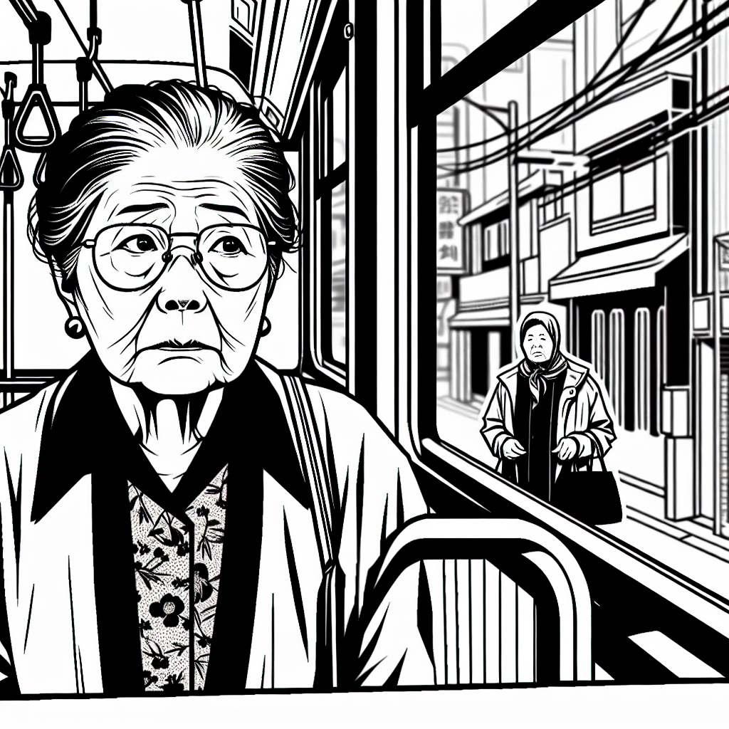
The arduous process of registration and check-in at KSCCLA causes many seniors to churn. Seniors are required to physically come in for every interaction, often waiting for hours in chaotic conditions. This prevents access to critical services like free lunches and social programs and increases the isolation of already vulnerable elders.
Insight
Physical presence is currently the only way to access information and take action at KSCCLA. But we realized that many seniors are already comfortable asking for help via phone. We hypothesized that a virtual assistant mimicking the warmth of a support call could reduce churn, especially if it worked across voice and screen interfaces. By “teleporting” into the center digitally, seniors could get the information they need, make decisions, and reduce trip anxiety.
Before: Seniors come to the center in person
After: They can now register from home
Solution
We created Mimi, a multimodal AI assistant designed to help seniors sign up for classes, check lunch availability, and navigate the system from anywhere. Mimi offers voice and chat based support, acting as both a guide and a companion.

Deliverables
High-Fidelity Prototype
We created a fully interactive prototype that simulates the real KSCCLA site with Mimi integrated. Seniors can chat, call, or navigate with Mimi to register for classes, check lunch availability, and ask for assistance. The prototype highlights voice interaction, visual feedback, and adaptive flows tailored for accessibility and language support.
Expressive Video Narrative
We produced a short video that follows James, a lonely Koreatown senior, as he navigates the center’s outdated system and discovers Mimi. The video demonstrates how Mimi helps him explore classes, receive real time lunch updates, and rekindle his joy for dancing, all without needing to stand in line or struggle with forms.
Background
The Koreatown Senior and Community Center (KSCCLA) serves as a lifeline for many older adults in Koreatown, providing free meals, classes, and community. But its systems are overburdened and entirely analog. Seniors are required to physically show up for every task, whether registering for classes, checking lunch availability, or asking questions.
Many seniors live alone, exprience limited English proficiency, and have mobility constraints. Some arrive as early as 2 a.m. just to hold a spot in line. Others arrive too late, after hours of travel, and are turned away. This rigid system increases isolation and discourages participation.

The Koreatown Senior and Community Center.

Seniors waiting in line at the Senior Center.
Research & Discovery
Desk Research:
- Only 4.82% of Koreatown residents have access to good parks, KSCCLA fills that role.
- 1 in 4 Korean seniors in L.A. live under the poverty line.
- 81% have limited English proficiency.
- Waitlists for subsidized housing span 10+ years.

1 in 4 Korean seniors in L.A. live under the poverty line, and many more lack access to local community.
Journey Research
We had a hypothesis that the need for physical mobility at the center was causing churn. The class registration journey looks like this.
Journey Map
Journey mapping showed many seniors begin their trip by 1:30 a.m. KSCCLA volunteers manage up to 100 people on class registration days. Seniors are turned away due to overcapacity and limited visibility into system status.

1:30 a.m.
Sunja wakes up
Article: Elders show up as early as 2 a.m. to secure the #1 spot.

1:45 a.m.
Eats instant ramen alone
Article: “When you’re old, everything is a hassle… I don’t want to cook ramen, so I used to eat cup noodles instead.”

1:50 a.m.
Walk to the bus stop in dangerous conditions
Article: LAPD seeks scooter rider in fatal hit-and-run of elderly Korean-American man

2:45 a.m.
Sit and wait for bus, hope it comes on time
Article: Buses regularly come 30, 40 minutes late
3:00 a.m.
Catch bus and fend off dangerous bus riders
Article: Seniors feel terrified on Metro, facing dangers with no staff in sight

3:45 a.m.
Wait and hold place in line
Article: The war of reception at KSCCLA
3:45 a.m.
Wait and hold place in line
Article: The war of reception at KSCCLA

10:30 a.m.
Wait for bus with no shelter
Article: In L.A's Koreatown, a lack of bus shelters debilitates elders
Insights:
- The stress of in person processes is pushing seniors to stop attending entirely.
- Seniors regularly call children or volunteers for help navigating technology.
- A majority rely on analog systems because the current digital alternatives are not accessible.


Reenactment of a potential seniors trip to the senior center. His plan for the morning and walking in unsafe conditions to the bus stop.
Framing the Opportunity
We hypothesized that presence, not attendance, was the real need. What if seniors could "teleport" to the center digitally to make decisions, sign up, or learn what’s going on?
The center knows there’s a real need for a way to be present digitally. But they also shared that many of their seniors deal with dementia or just aren’t comfortable with technology. The current website is built more for typical web users, not for older adults with unique needs. Right now, seniors often rely on calling in, visiting in person, or asking family for help, none of which is really supported by the current site experience.
"Maybe in the future we have online registration on the homepage... But, but that is very, uh, difficult to do... Most of our seniors don't want to use the computer. And they can't use the computer."
- KSCCLA staff on the biggest thing they'd change about the sign-up process.
How Might We
How might we rethink presence at the KSCCLA, making information and action available from afar, so that seniors travel more intentionally?

Current Korea Town Senior Center homepage
Design Strategy: Introducing Mimi
We imagined Mimi as a friendly, AI-powered assistant that could recreate the comfort of a support call, something seniors already trust. We knew that digital presence didn’t just mean being online, it meant being guided. So we focused on making Mimi accessible through multiple modes: phone, chat, and voice.
Lunch storyboard
We sketched out an early idea where seniors could reserve a lunch box ahead of time, so they’d know the trip to the center would be worth it. The goal was to reduce stress and uncertainty by giving them a guaranteed pickup window.
But after speaking with the center, we learned that this wasn’t realistic. They prefer a first come, first served system to avoid waste, any unclaimed boxes would spoil. So we pivoted away from reservations and instead focused on giving users real time updates about availability.

In this experience, there's a time block every morning for reserving lunch.

Here, Sunja places her order the night before.

We explored a daily raffle system: winners could reserve a lunch slot, while others got updates and advice on whether it was worth making the trip.
Precedents
We drew inspiration from tools like SK Telecom’s ARIA, speculative UIs like Apple’s Knowledge Navigator, and the conversational warmth from the film Her. These helped inform a tone and structure that was both futuristic and grounded in emotional support.

We looked to SK Telecom’s ARIA, which lets seniors use voice commands to call friends and play games.

Apple’s old concept, the Knowledge Navigator, inspired us with its vision of a voice driven operating system.

the film Her helped shape our thinking around a friendly, goal oriented AI that feels personal and intuitive.
Conversation Design
We started thinking, what if Sunja didn’t have to go to the center every three months just to sign up for classes? What if she could do it from home?
That led us to a find first approach. If Sunja says she wants to book a class, Mimi needs to understand that and respond accordingly. That means the system has to support not just chat, but also account creation and easy access to the full list of available classes.
Multimodal Design
We found that audio only interactions, especially for tasks like filling out forms, can be really frustrating. People can only hold about 7 items in memory at once, so reading out all 42 class options just doesn’t work.
That’s why we focused on making Mimi context aware. She understands what the user is seeing on screen and can guide them based on where they are and what they might be trying to do next.


Conversation example between Mimi and an elderly man.
Registration Storyboard
Designed to analyze how seniors would move through the system.

Clerks advertise to seniors about the digitization of the queueing process.

Sunja onboards and chooses her language through audio.

Sunja onboards through natural language.

Sunja ranks her favorite classes to be chosen in the raffle.

Sunja receives a notification that she got into one of her favorite classes after the fact.
Onboarding
We designed Mimi to lead with audio, listing out options that users can either respond to by speaking or selecting on screen. This makes the experience more approachable for seniors who might not be comfortable with typing.
Audio website onboarding.
We also explored how Mimi could adapt for users with memory challenges, like dementia. The interface would shift based on the flow of conversation, and Mimi could offer gentle prompts or alternative paths if, for example, a user didn’t remember their address.
This idea was a lot like Her, an assistant that understands your routine and adjusts accordingly. Mimi could do something similar, using context to filter choices and shape the interface based on each person’s needs.
Iterative Design Process
Early Prototypes
Our first prototype explored how users would discover and interact with Mimi starting from the homepage. The landing page introduced Mimi as a friendly assistant ready to help with tasks like lunch updates, class registration, and general support. A clear message invited users to “Try out our new virtual assistant, Mimi,” reducing ambiguity and encouraging exploration.
Clicking this prompt led to a dedicated page that explained what Mimi could do. We outlined her core capabilities, like checking lunch availability, guiding class sign ups, and answering questions in Korean or English, to build confidence and familiarity.
From there, users were given two simple options: Chat with Mimi or Call Mimi. Whether the user preferred typing, speaking, or hearing a voice, Mimi was designed to meet them where they were most comfortable.
Choosing either option would lead to the conversational UI, where Mimi would guide the user through their request step-by-step. This early flow helped us test how seniors reacted to a multi-step introduction versus being dropped straight into a chatbot, and gave us insight into what kind of framing built the most trust.
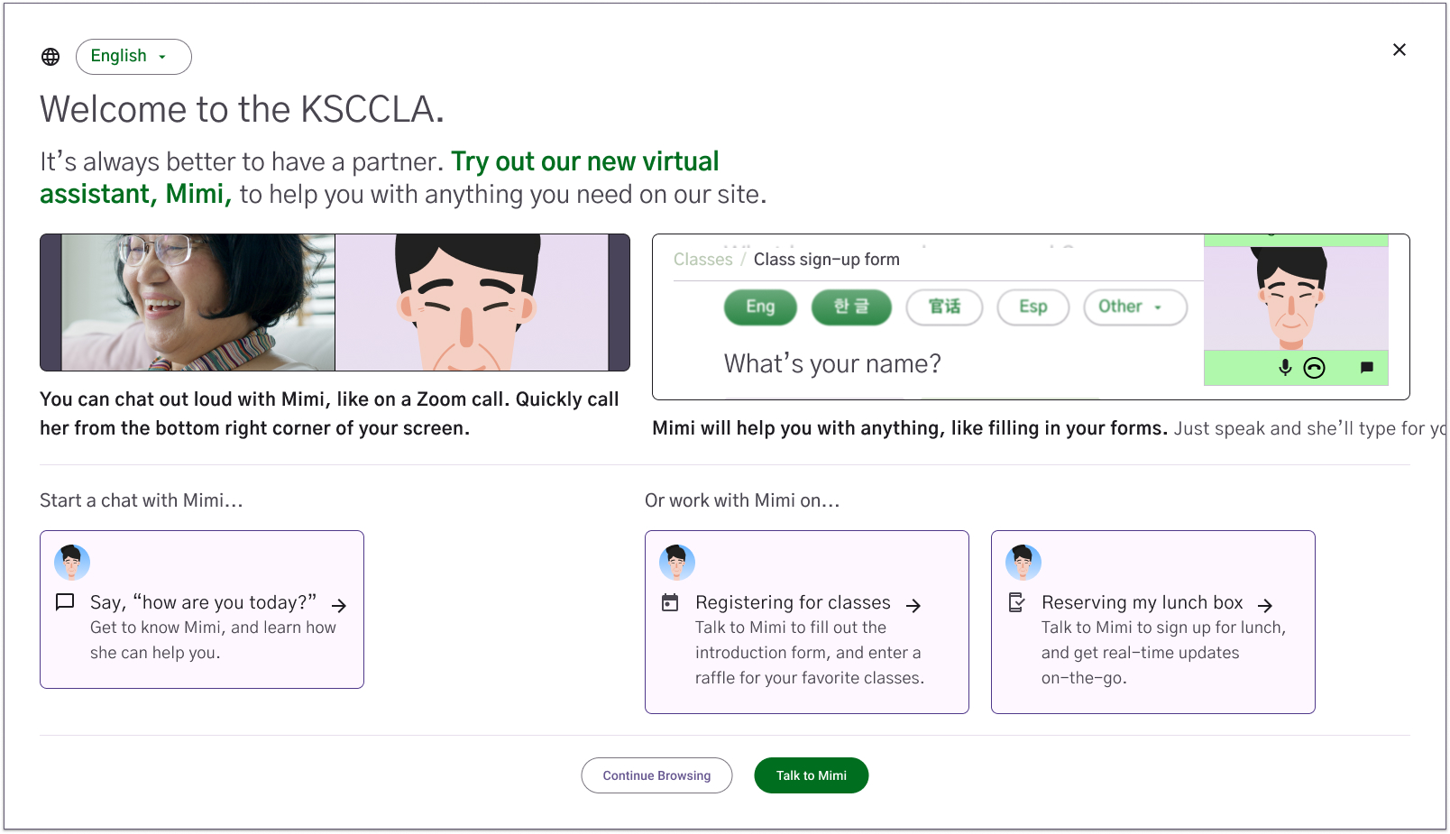
Website homepage. Featuring the talk to Mimi service.

Talk to Mimi landing page. Options for calling on the web, text messaging, or calling on the users phone.

Calling Mimi on the web UI, featuring a chat box for conversation history.

Lunchbox registration page.
Early Prototypes User Testing
During testing, we found that users were uncomfortable being asked for personal details, like their address, apartment number, income, or documents right at the start. Without clear explanations or visible signs of trust, it felt intrusive. Testers wanted to understand why certain questions were being asked and what the information would be used for.
On the upside, they really appreciated being able to respond by voice or using talk-to-text, which felt more natural, especially for those who weren’t confident with typing or navigating menus. That said, people still wanted visual confirmation that what they said had been heard correctly.
The homepage also felt overwhelming, too many options and no clear focus. This made it hard for users to know where to start. Simplifying the layout and strengthening the visual hierarchy became a key priority moving forward.
Mid-Fidelity Prototypes
In this phase, we focused on refining the class sign-up flow based on the feedback from earlier testing. Users wanted fewer steps, larger text, and more clarity about what classes were available and how to register. We responded by streamlining the interface, improving the visual hierarchy, and emphasizing key actions.
The prototypes shown below illustrate Mimi guiding users through the class registration process, confirming their interests, helping them choose the right options, and making the experience feel personal and supportive.
Overall, this round of design aimed to make registration easier, faster, and more intuitive, while maintaining accessibility through both voice and visual inputs.
Improved class registration flow.

Website homepage concept featuring a simpler layout.
Second website homepage concept featuring more information.

Class registration page concept featuring a simpler layout.

Second class registration page concept featuring more visuals.
After users submitted their class selections, they are prompted to create a profile. We tested a Claude style interface where Mimi could automatically fill in the chat with helpful details and documents based on what the user had already shared.
User Testing
We ran another round of testing with three seniors, two of whom were Korean. One big takeaway: we need a smart default.
Right now, we offer three different starting options, one with audio, one without, and one that lets you explore freely. But the variety ended up confusing users. They weren’t sure where to begin and often didn’t engage at all. It made us ask: how can we make it feel more like something they already know? Users also had trouble finding the floating action button that’s supposed to help them finish class sign-up. Because of that, they missed the next steps entirely.
Another recurring issue was that basic info, like class types, dates, pricing, and contact details, wasn’t clear or easy to find. Everyone wanted to know what’s being offered, how much it costs, and how to join, without clicking through tons of pages. Across the board, the font was too small, the visual hierarchy was weak, and there was just too much going on. It made the site feel cluttered and tiring to use.
The sign-up process also felt too long. Most people just wanted to give their name, phone number, and maybe an email. They didn’t want to fill out a whole application just to show interest, and one thing that came up again and again: they wanted to talk to a real person. The lack of a visible phone number made people uneasy, especially those who don’t trust chatbots or online forms.
Quotes from user tests
“I would go to Google, call them up, and ask what they offer, what the price is, and what the time is, all that by calling them.”
- Korean User: W.
“And the other thing we talk about sight impairment or challenges. Don’t forget the hearing challenge as well. If you start doing audio stuff, you’ve got to realize there’s going to be a way if we can’t punch it up on our device, we’ve got to be able to hear you.”
- American User: F.
“You say the talk to someone, right? You need to have a microphone to speak to someone, but most of the senior, they don’t know how to make a microphone. That’s not easy, or the call on the phone. I don’t know how to do it…”
- Korean User: A.
Final Design
Feedback Improvments
For the final prototype, we focused on simplifying the experience and making key actions more obvious. We cleaned up the layout, removed distractions, and made the flow for meeting Mimi much more intuitive.
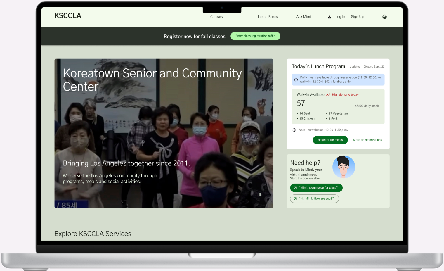
Right away, users are clearly shown what Mimi can help with, and her phone number is front and center, no more digging around for support. We wanted to reduce hesitation by making it feel like a friendly invitation, not a tech hurdle. Overall, the prototype feels lighter, more approachable, and tailored to how seniors actually navigate digital spaces.
Feature Highlights
Homepage Pop-Up
As soon as users land on the site, they’re greeted by Mimi through a clean, focused pop up. The options are simple and direct:
- Call Mimi for help using a phone
- Chat with Mimi to begin a guided flow
- Watch a how-it-works video for a quick intro
- We wanted the homepage to feel like a conversation starter, not a maze of links.
Class Discovery Calendar
Seniors can browse available classes in a simplified calendar interface. Mimi can filter results through voice or chat based on time, type or past activity. The system also remembers previous choices and preferences to make future sessions faster and more relevant.
Lunch Box Updates
Instead of guessing or waking up at 2 a.m., users can now check how many lunch boxes are left before they leave home. Mimi gives clear status updates like “85 lunches left, line moving quickly” so users can make informed decisions.
Conversational UI
We implemented a Claude style chat interface where Mimi fills in forms by asking short, focused questions. She only asks what’s essential and uses progressive disclosure when more info is needed, helping reduce cognitive overload.
Onboarding
We took a language first approach to onboarding. Users can say “I speak Korean” to begin in their preferred language. The experience is fully supported with voice, subtitles, and visual feedback. It’s built to adapt to each user’s comfort level with tech and language.
Smart Defaults & Visual Accessibility
To reduce decision fatigue, we guide users down a recommended path instead of giving too many options upfront. Fonts are large, colors are high contrast, and layout is intentionally linear. It’s easy to see where you are and what comes next.
Persistent Help & Phone Support
A help button stays accessible on every screen, offering quick links to chat with Mimi, call the center, or view frequently asked questions. This supports users who feel stuck and want human backup.
Emotional Design
Mimi’s tone is warm, calm, and encouraging. Rather than system speak, she uses phrases like, “Let’s take this one step at a time,” helping build trust and lower the intimidation factor.
Together, these features make Mimi not just a functional tool, but a familiar, reassuring presence designed to meet seniors where they are.

Website homepage, featuring a pop-up screen to interact with Mimi.

Using the pop-up, the user can choose how they want to interact with Mimi. In this example here, the user gets instructions on how to call Mimi on their phone.

Once the user calls Mimi, they input a code to sync the website UI with the call.

When a user wants to book a class, Mimi pulls up the class registration page and asks the user to pick the class they want.

Then Mimi pulls up the website calendar and asks the user which class date they would like to book.

Once the class is booked, Mimi pulls up a confirmation page and information on their booking. Once the users needs are met, they can just hang up the call and Mimi will close.
Reflection
Results
- 100% of participants preferred the final Mimi flow over the current website.
- 80% said booking classes with Mimi felt intuitive and was the simplest option.
- 60% naturally chose Mimi to book classes instead of clicking through the site.
- Faster critical tasks: late night ride help and class registration became self-serve without staff intervention.
- Lower friction for elders: flows mirrored analog habits (plain language, step by step prompts, optional phone handoff).
- Trust by design: culturally sensitive copy and voice UI reduced drop offs in first time use.
- Service ready: the blueprint aligns staff, volunteers, and tech so volunteer run orgs can scale without losing their personal touch.
What I Learned
- Real impact came from pairing UX with service design, cultural sensitivity, and storytelling, not just screens.
- Presence doesn’t always mean being there: thoughtfully designed assistance can feel human at any hour.
- Emotional intelligence in systems design is what turned Mimi from “an AI assistant” into a bridge between digital services and analog lives.